Turning raw hospitality data into a product.
Tubr is a 0→1 analytics product for hospitality businesses. I partnered with the founder and a data scientist to turn a stream of raw point-of-sale data into something a bakery owner - and their staff - could actually act on: journeys, IA, dashboards and a brand, from scratch.
A bakery owner is sitting on data they can’t read.
Hospitality businesses generate a constant stream of sales data - every transaction, every item, every hour. But it lives in a point-of-sale system and a pile of spreadsheets, and reading it means flicking between tools after a long day on your feet.
Tubr had the data pipeline and a pilot bakery, but no product. My job was to turn that raw signal into something a busy owner would open every morning - and that their staff would understand without any training.
Raw data is not the same as a decision.
The challenge was three things at once: make the numbers mean something, serve two very different users, and do it under a brand that did not yet exist.
Numbers without meaning
Sales totals and transaction counts don’t tell you what to do. The product had to translate data into a next action, not just a chart.
A manager and their staff
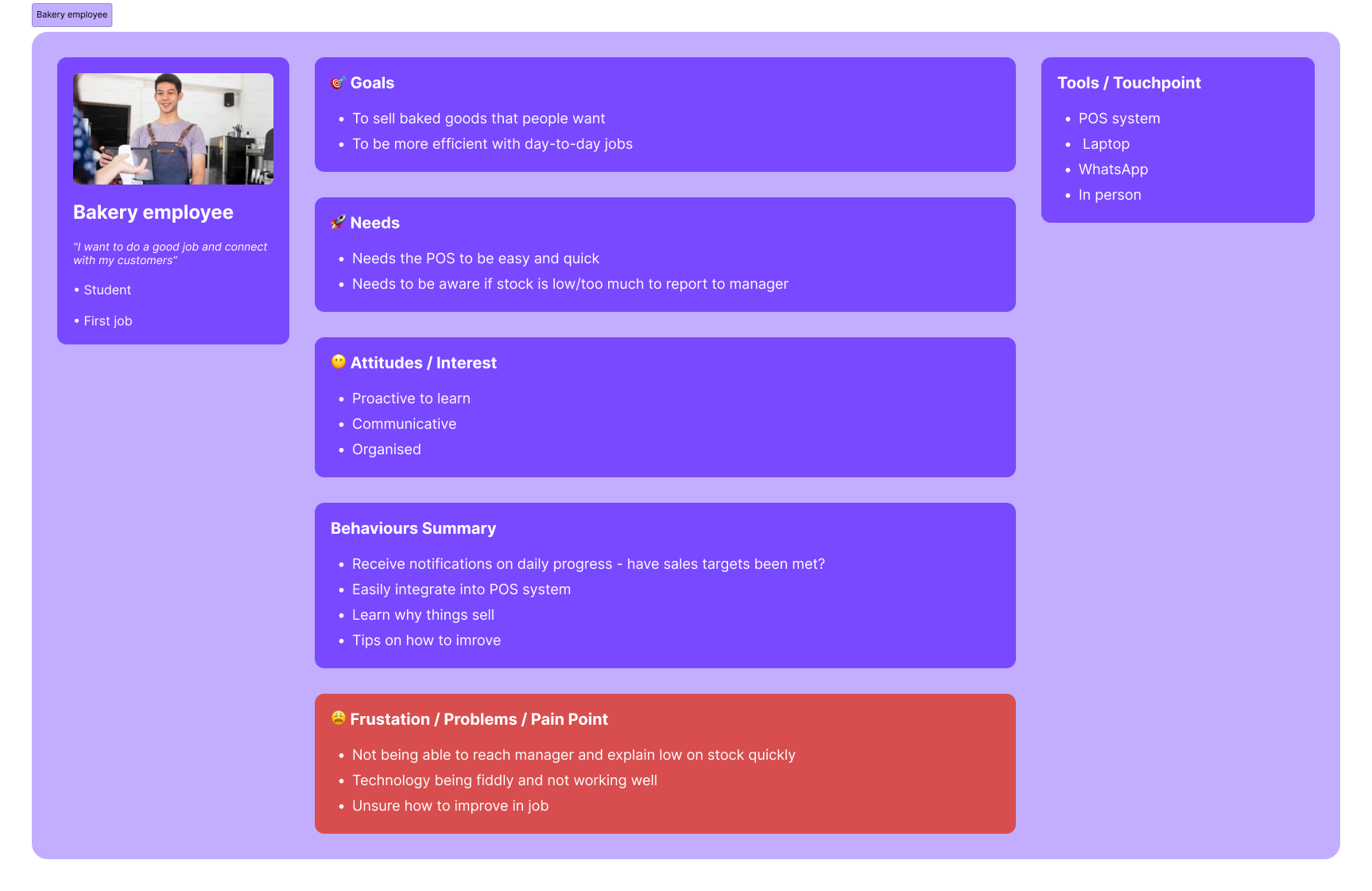
The owner needs forecasting and the week in full; an employee needs one timely nudge mid-shift. Same data, opposite needs.
A product with no face
There was no identity to design within. The look, the voice and the name had to be built alongside the product itself.
Lead designer on a blank page.
I led design end to end alongside the founder and a data scientist. I ran the discovery, mapped the journeys, defined the information architecture and the split between manager and employee, designed the MVP, and created the brand - turning a data pipeline into a coherent, usable product.
From a pipeline to a product people open.
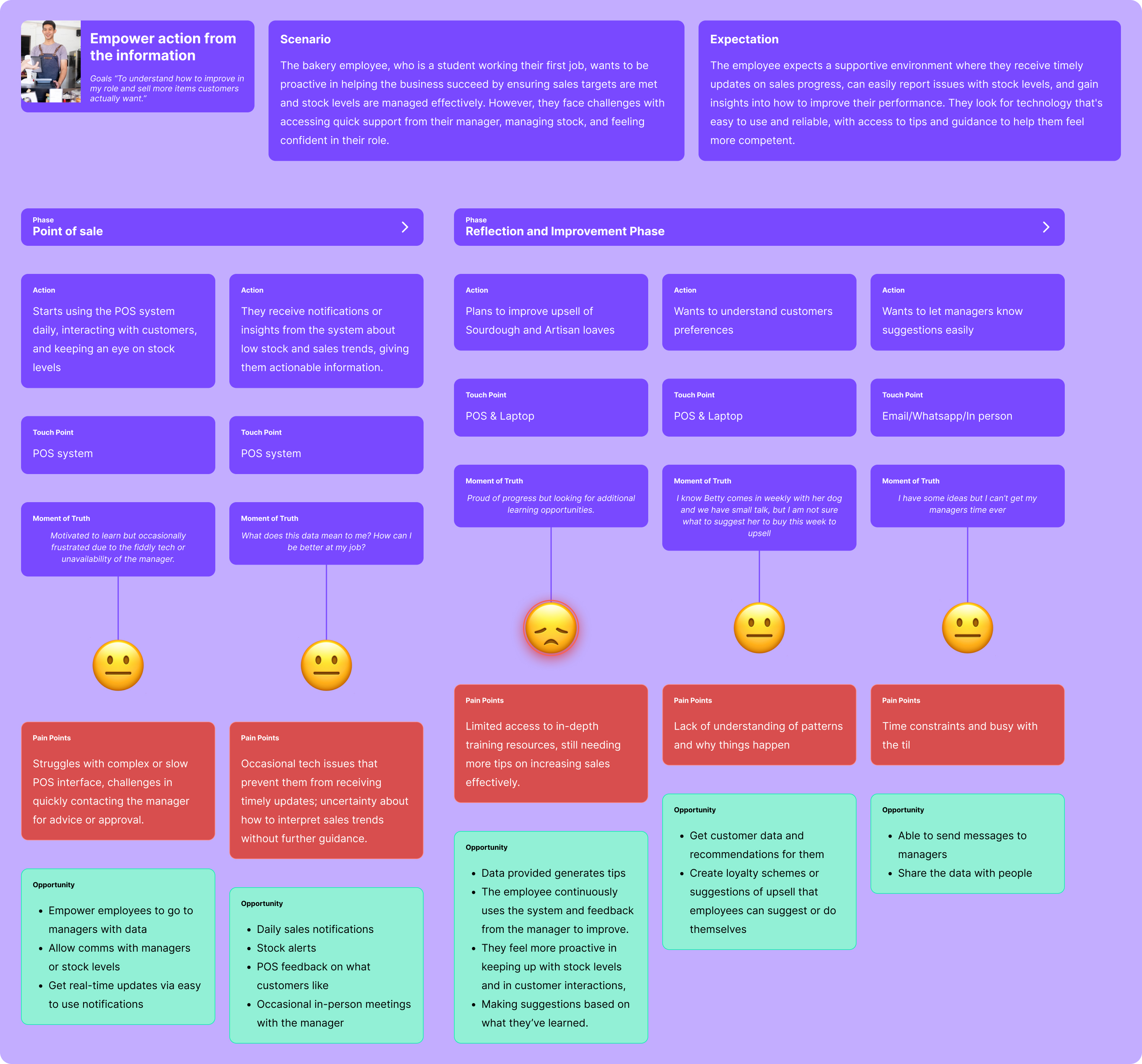
Walk a day in the bakery
I mapped the owner’s day end to end - point of sale, ordering ingredients, planning, managing staff - capturing the moments of truth, the pain points and the opportunities at each step. The recurring theme: people were wasting time and guessing where data should have given them an answer.
Two products in one
The journey made the split obvious: a manager experience for forecasting and the full week, and an employee experience for a single in-the-moment nudge. I defined the sitemap and IA around that divide, then built the brand foundations - colour, type, spacing and icons - so the data could feel friendly rather than corporate.
Plain language first
The MVP leads with insight, not charts. The home is a weekly summary; a plain-language headline tells you, in a sentence, how the week is going; the factors that contributed sit underneath, and the deeper charts are there when you want them. The employee app strips this right back to a single, timely prompt.
The choices that made data feel human.
A handful of decisions turned a data feed into a product a non-technical owner would actually use.
Split the manager and the employee
Same data, opposite needs. Two tailored experiences beat one compromised app that serves neither well.
Lead with plain language
A sentence - you’ve sold more than usual by now - before any chart. Insight first, evidence second.
Show the why, not just the what
Every headline number is backed by the factors that drove it, so the owner can act with confidence.
Lightweight for staff
Employees are on their feet - their view is one glanceable prompt, responsive right down to a phone screen.
A brand from zero
Purple, friendly type and a warm voice - so dense analytics feel approachable, never intimidating.
Weekly summary as home
The week, not the day, is the unit a bakery plans around. The home opens on the rhythm that matters.
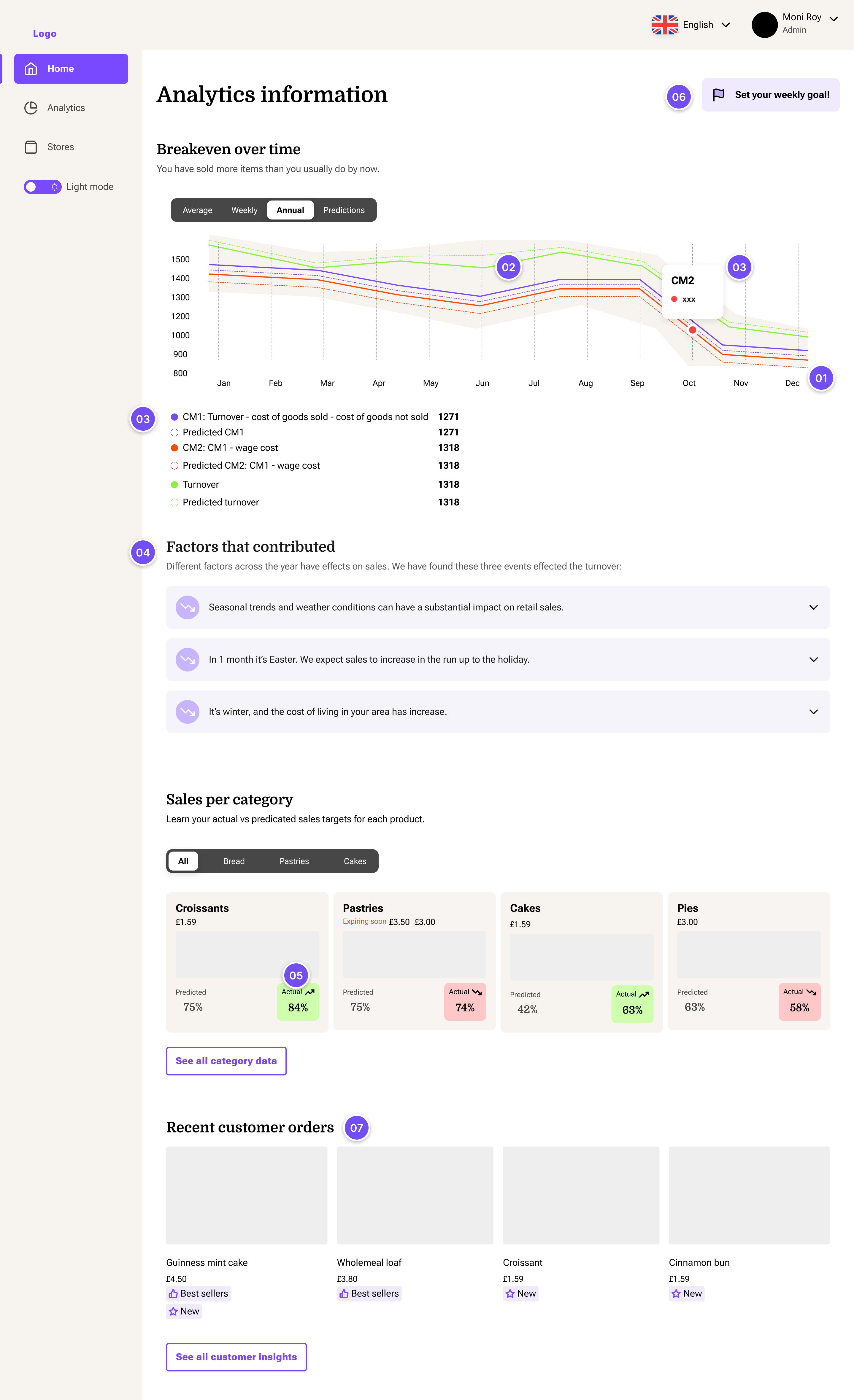
The chart is the hero - largest, top-left - because it answers the daily question, “am I on track?”, in seconds. The plain-language takeaway sits above the chart, not below it.
Solid lines are actual, dotted are predicted, the grey band is the confidence range. I kept the forecast visibly uncertain - hiding that a projection is a projection would make the tool feel dishonest.
Three metrics, three fixed colours, used consistently so the legend is never re-learned. Finance terms - CM1, CM2 - are defined inline, so a non-finance owner learns them without feeling tested.
Simplest view by default, depth one tap away via the tabs, the “why” narrative collapsed below. Built for two readers at once: the one who trusts the headline, and the sceptic who checks the reasoning.
Predicted and actual sit side by side with a green-up / red-down chip, so “did we beat the forecast?” reads by colour before you read a number. Cards are a uniform size on purpose - like compares with like.
The “set your weekly goal” CTA is the visible entry point to personalisation - from there the platform tailors its recommendations to the user over time.
Individual order detail sits last - it is the least decision-critical, so it is available but never competes with the headline metrics.
The brand that made data feel friendly.
With no identity to start from, I built the brand alongside the product - a confident purple, warm type and plain-spoken copy that makes analytics approachable for a non-technical owner.
A data pipeline, turned into a real product.
Tubr went from a raw data feed to a coherent MVP - a manager dashboard, an employee experience, a clear information architecture and a brand, defined and designed alongside the founder and data scientist. It gave a non-technical owner a reason to open the product every morning.
Working at 0→1 with a founder and a data scientist taught me to design from the data outward - to start with the signal that exists and shape it into a decision, rather than designing screens and hoping the data fits.