Unifying a European fintech platform with one system.
Qwist runs bank-switching products across Europe - one B2B, one B2C, in market after market. As lead product designer I built Vault, the design system that unified them, and led the UX/UI redesign that lifted conversion in the Spanish market.
Two products, many markets, drifting apart.
Qwist helps people and businesses switch banks across Europe. Over time that became two web products - a B2C flow for individuals and a B2B flow for partners - each shipped market by market, each drifting into its own patterns and components.
The result was a platform that looked and behaved differently depending on where you entered it, and a Spanish market where conversion was lagging. Inside the switch sat an embedded “connected banks” widget, built by a separate partner team - so even some components weren’t fully ours. The brief: make it feel like one coherent system, and make it convert.
One brand, pulling in two directions.
The work was to unify a B2B and a B2C product across several markets without flattening what makes each one work - and to lift conversion while doing it.
B2B and B2C on one platform
A partner integrating a switch flow and an individual switching their own bank need different things from the same underlying product.
Localised, not just translated
Every market has its own banks, rules and language. A pattern has to flex without being rebuilt each time.
Trust at every step
Moving your bank is high-stakes. Hesitation costs conversion, so every screen has to earn the next click.
Lead designer and system owner.
I led the UX and UI across Qwist’s bank-switching products and owned Vault, the shared design system. The work split into two streams: the customer switch flow - onboarding and the dashboard - and a redesign of the embedded connected-banks widget, which a partner team builds but which lives inside our flow. I aligned both on Vault and led the Spanish-market redesign with conversion as the explicit goal.
Unify the foundations, then lift the numbers.
Audit two products at once
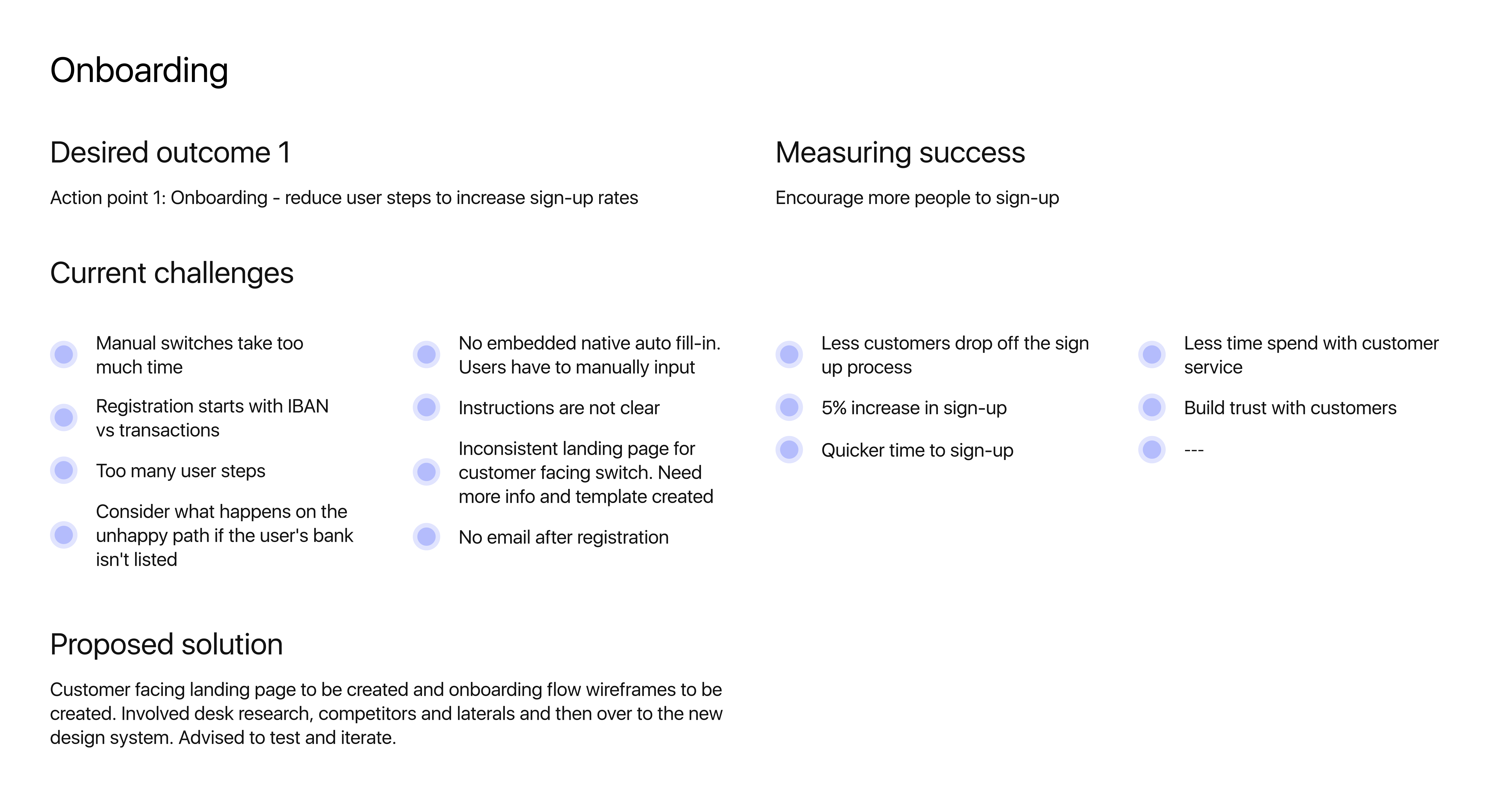
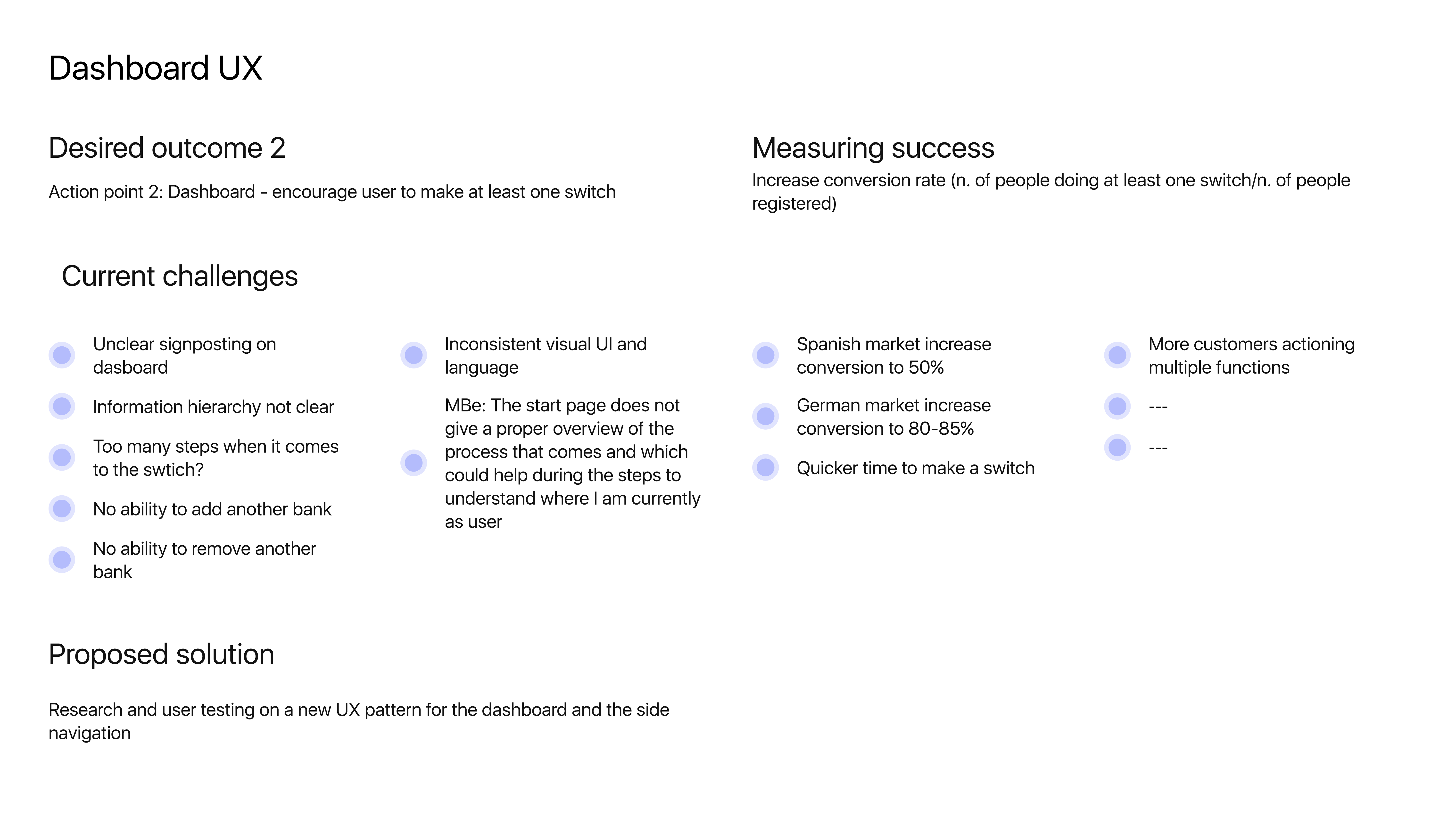
I audited the B2B and B2C products side by side across markets, mapping where they diverged and why. Patterns had been copied, tweaked and forked so often that the same task looked different in three places. I framed two action points - onboarding and the dashboard - each with current challenges, a desired outcome and a way to measure success.
Vault: one set of foundations
I defined Vault - shared tokens, components and flow patterns both products could draw from, in light and dark modes, with localisation built in so a market swap did not mean a redesign. The dashboard action point set the target: encourage every registered user to make at least one switch.
Redesign for conversion
With the system in place, I led the redesign of the Spanish-market switch flow and aligned the partner-built connected-banks widget to it - simplifying steps, clarifying status and progress, and building trust at the moments people hesitate. Each screen was reworked to earn the next click, then validated against the funnel.
The choices that made one platform out of two.
A few decisions unified the products and moved the conversion numbers in the same stroke.
One Vault, not two kits
A single system both products draw from - instead of a B2B kit and a B2C kit quietly diverging.
Localise, don’t duplicate
Patterns flex to each market’s banks, rules and language, so a new market is a configuration, not a rebuild.
Design for the hesitation
The high-stakes moments - confirming, authorising, waiting - got the most attention, because that is where conversion is won or lost.
Status you can always see
Switching a bank takes days. Clear, persistent progress keeps people confident through the wait.
Adapt, don’t lift-and-shift
The Spanish redesign was reshaped around local behaviour, not a translated copy of another market.
Shared spine, separate needs
B2B and B2C share foundations but keep the flows each genuinely requires - unity without forcing sameness.
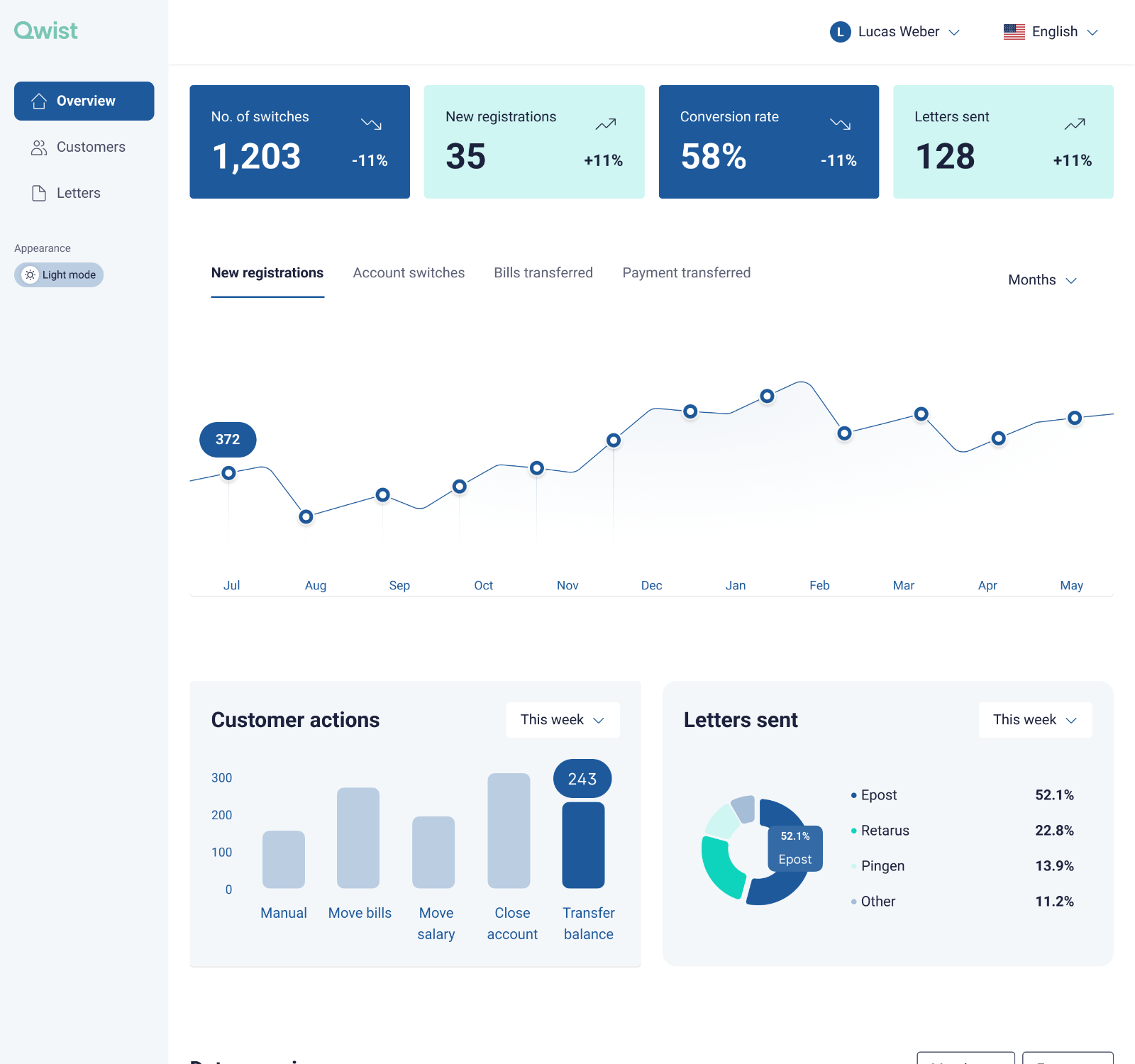
The metric the whole redesign is judged on - 58% - reads at a glance, next to switches and letters sent.
Registrations plotted over a year - 372 this month - so a dip is visible before it becomes a problem.
Customer actions break down what people actually do - transfer balance leading at 243 this week.
Letters-sent split - Epost at 52.1% - keeps the delivery side of a switch visible, not buried in a report.
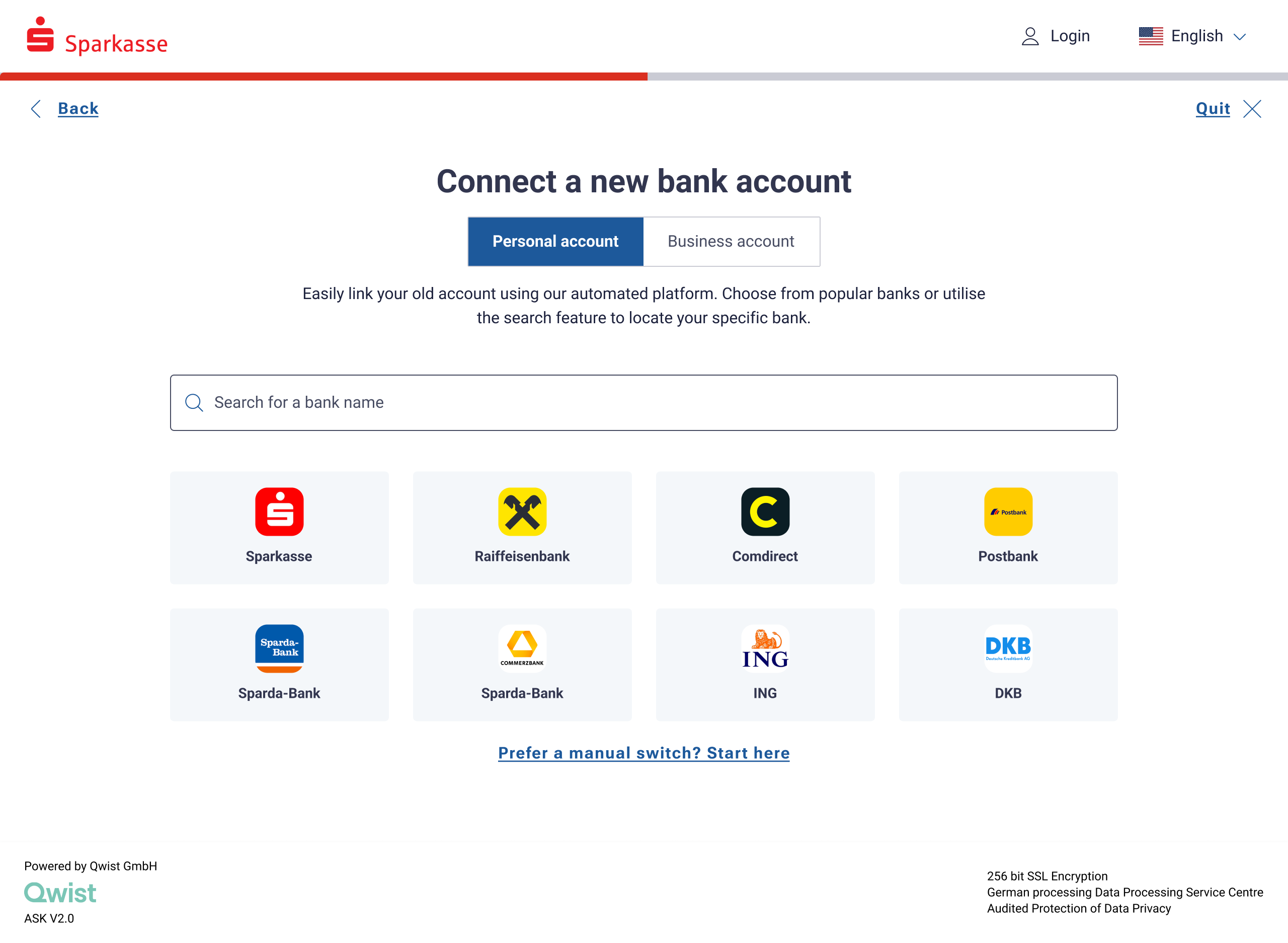
A single personal / business toggle routes B2C and B2B down the same flow - the system underneath is shared.
Search sits above the fold so anyone who already knows their bank skips straight ahead.
Popular banks per market are shown as logos - instant recognition, fewer mis-taps, localised country by country.
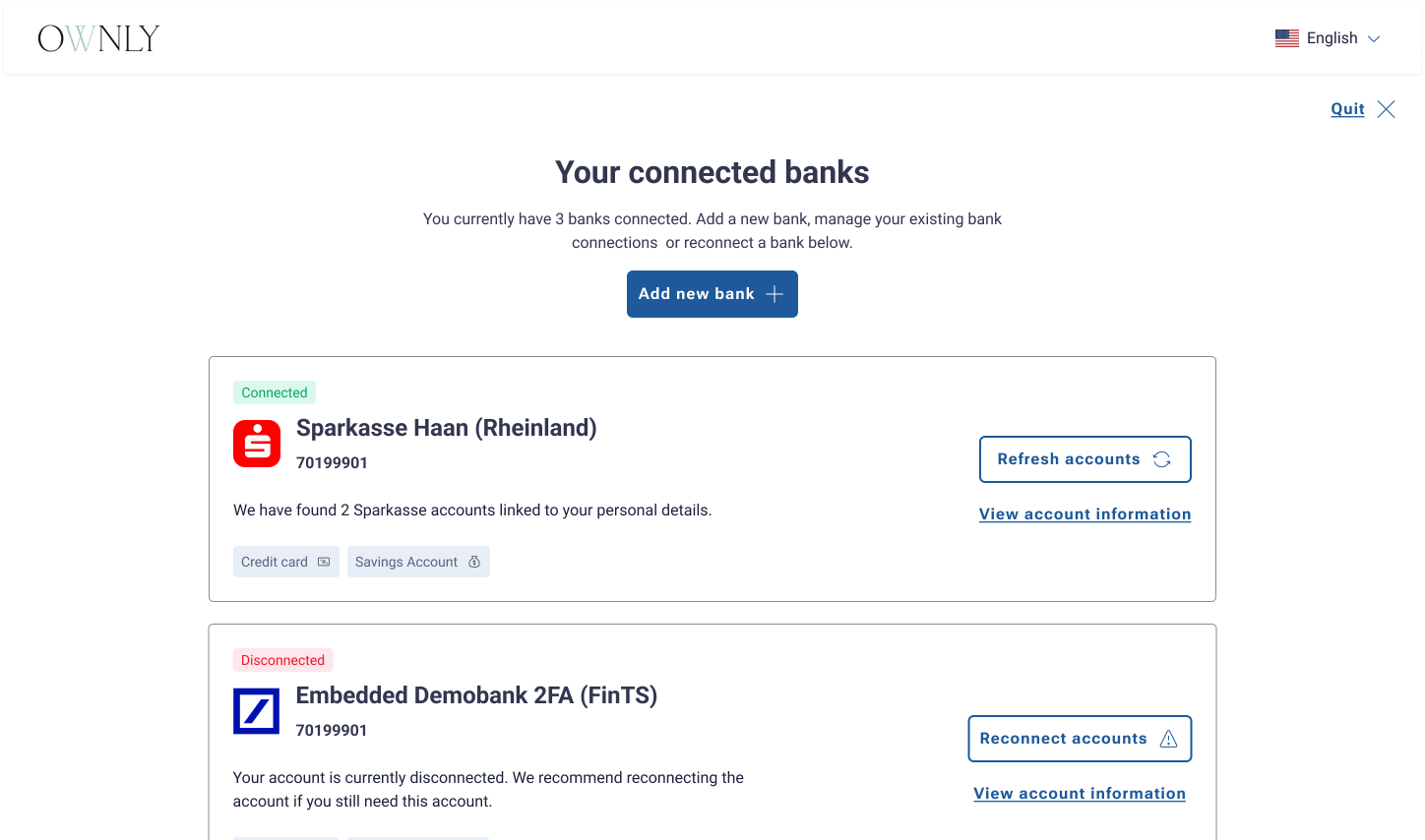
A manual-switch fallback for the unhappy path when a bank isn't listed - no dead-ends, so conversion holds.
The system behind both products.
Vault is the shared language that made one platform out of two products, many markets and even a partner-built widget - foundations, components, light and dark modes, and localised flow patterns, built once and reused everywhere.
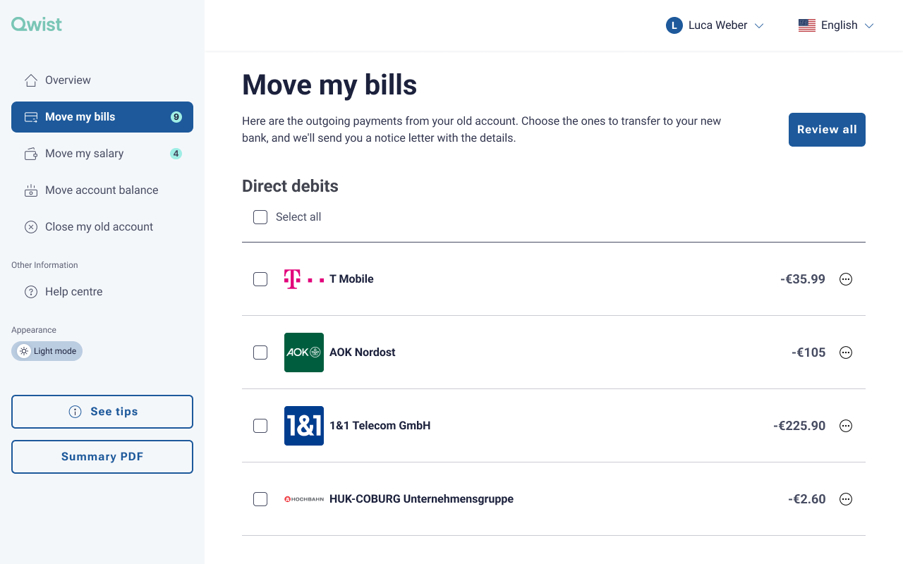
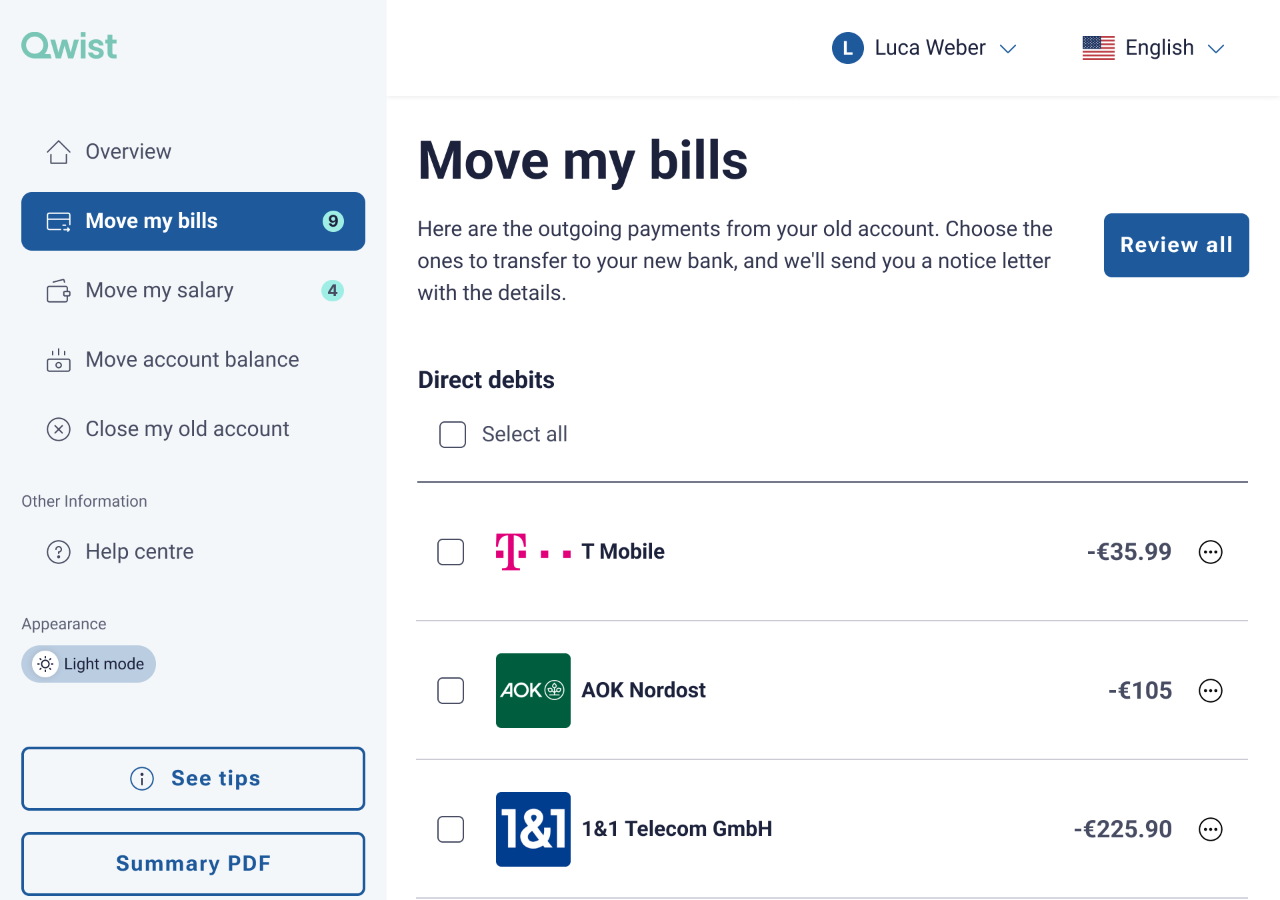
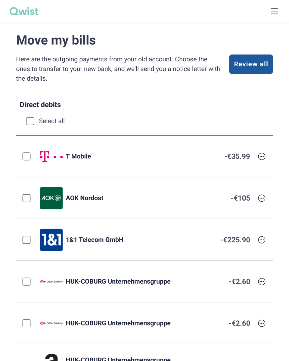
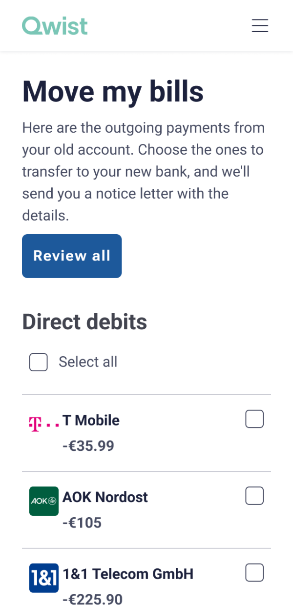
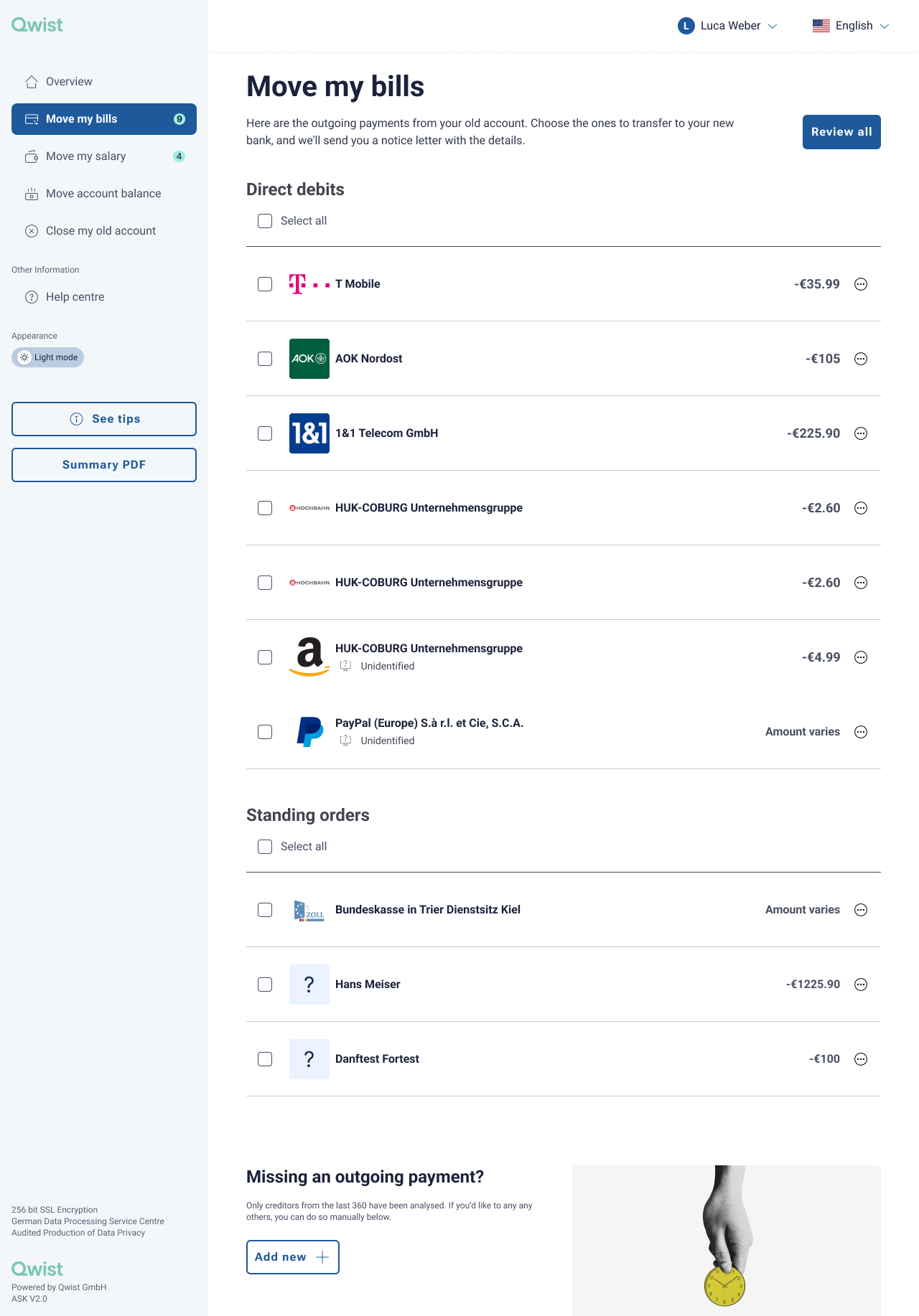
One screen, the Move my bills flow, reflowing from a full-sidebar desktop layout down to a single-column phone - one set of Vault components, every breakpoint, no redesign.
A big part of the project was the words. Bank-switching is dense with regulatory and engineering language - I rewrote it into something a person would actually say: plain, calm and in the second person, so a high-stakes task feels handled rather than technical.
One platform, and a market that converts.
Vault brought Qwist’s B2B and B2C products - and the embedded widget - onto one set of foundations, with localisation and light and dark modes built in so new markets ship faster. The redesigned Spanish flow targeted a step-change in conversion, and the shared system gave every future market and partner a head start instead of a fresh build.
Unifying two products taught me that a design system is a business tool, not a tidiness exercise - the same work that made the platform consistent is what made it convert and scale.